
I am a computer scientist. I went to university to learn how to be a computer scientist. Some of the classes I took were named things like “data structures” “FORTRAN IV” “Assembly” and “Compilers”.
I’ve written three compilers, around four or five different interpreters, studied and understand bit manipulation.
I’ve done bit fiddling on a panel of switches to boot a computer.
With all of that, I’m a noob compared to Donald Knuth. This guy wrote the book, literally, on computer science. The Art of Computer Programming is that book.
What is more amazing than writing that book, is how that book came to exist. I’m telling this from memory, so I might get some details wrong.
At the time, the cost of publishing textbooks was high. If you wanted to drive the price up, just add a math formula to your textbook.
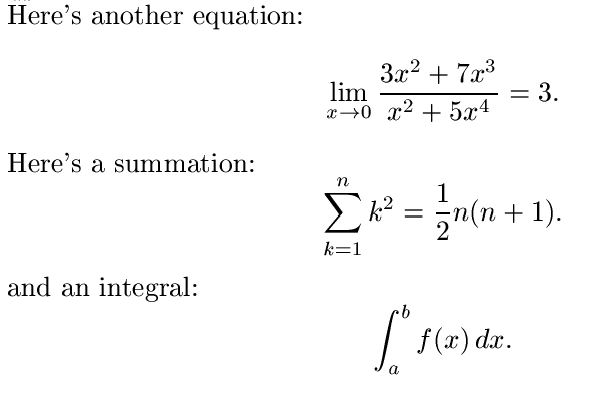
That little bit of math could add hundreds of dollars to the cost of making a textbook. Worse, it was typeset manually by people that might not get it right.
Donald didn’t like that. So he decided to just write some software to do it for him. But first, he needed to follow the concepts.
That concept is what we now call “write once”. You don’t define something in two different places. You define it once, and everything is built from that single source.
He wanted to write a program to typeset books that was self documenting and “did the right thing”. So he invented a new language, called “web”. He now needed a program to convert “web” files into something that a computer would understand.
He wrote “tangle”. Tangle takes a .web file and produces a PASCAL file (programming language) and a .tex file. The pascal program that was created can then read the .tex file and produce a typeset book, ready to print.
Donald taught himself typesetting. His programs and books taught me programming.
Donald needed to typeset and then print the book. To typeset the book, he needed to know the fonts that were being used and more than that, he had to know how each glyph in the font was positioned within a rectangle.
So as an example, consider the word “fit”. This word has three characters, but when printed in a professional font, the “fi” characters are combined into a single glyph that looks great to the eye.
Donald went out to get a professional font. Nobody would sell it to him for reasons. So… Donald learned how to create fonts. He invented an entirely new way of describing fonts. And wrote another book in “.web” to create metafont.
The fonts we use today are TrueType Fonts or derivatives of that format. TrueType fonts are based on the metafont format.
This is where I became interested in typesetting and fonts. I learned more than a little bit, and I’m still a noob about it.
Fonts have a purpose. Each font is designed for a particular purpose. For that purpose, they should do a good job.
There are “display” fonts and “text” fonts. Display fonts are used for big things, like headlines. Text fonts are for reading things.
If you look at the characters closely, you might notice that some characters have little “feet” or flourishes on them.
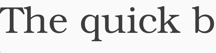
You should see the base on the bottom of the “q”. It has a sort of rounding to it. It flows nicely. These are “serifs”.
This font is based on URW’s New Century SchoolBook font. It is one of the most common fonts used in books. It is an easy-to-read font when you are looking at a wall of text.
When it is enlarged, like the image above, that readability is not as good. When we are using large characters, such as in a banner or headline, we want to use a “sans serif” font. A font without serifs.
The most famous of those is Helvetica. This is owned by Adobe. Microsoft created their version of Helvetica, called “Arial”. There are free versions that look nearly the same.
The default font that this site uses is a sans serif.
As I said the other day, I’m writing software to help with teaching English as a Second Language. We are using some texts designed for different levels. I need to be able to display text in a video meeting that was easy for my students to read.
So I picked one of the ugliest fonts I’ve ever found.
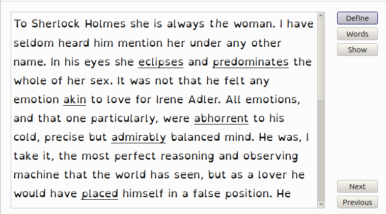
It just looks wrong. It looks like it is melted, it doesn’t have weight in any one direction. Sometimes a stroke is heavy on the left, sometimes on both sides. It is just wrong.
But its purpose is not to be beautiful. Its purpose is to be easy to read. It is.
The font is called “OpenDyslexic”. It is designed to help combat the issues of dyslexia. Since I have dyslexia, I should use it more often. I don’t.
The interesting thing is that all of my students using it were thrilled with it. They found it very readable.
Better still, my wife, the reading specialist, loves it. She loves it enough that she is going to get it installed at her school for her to use with her students.
Had no idea of the cost increase involved. Thought it all was some magic placement of characters.
I was surprised at the OpenDyslexic font. I’ve never seen it before. At first glance it seemed unreadable. However, actually reading it was like skimming cream. It flowed so nicey I rolled through it without actually “seeing” the font itself. What a difference!
Re tex, it and latex were around when I was in grad school, but MS Word (with Equation Editor) was just coming into its stride, and tex/latex faded away, or seemed to.
.
Funny … now the younger crop of scientists seem to have “rediscovered” them.
Interesting. font-opendyslexic is right there in the Debian package list. I’ll give it a whirl.
I don’t like that font; it doesn’t do for me what you say it intends.
On “display” and “text” fonts, that’s an important distinction professionals know and many other people do not. It really matters. Most fonts in my experience are display fonts: they do very nicely in small doses but are intolerable if you set a whole page with them. Not just Helvetica but fonts like Poster Bodoni, Kids, Avant Garde, etc. Conversely, text fonts may actually do fine for display but they tend to be rather bland, so if you want to get attention they won’t serve.
Helvetica doesn’t belong to Adobe, actually; it’s much older and belongs to Mergenthaler-Linotype which goes back to the “hot metal” technology of the 19th century. I really dislike Helvetica because all too often it is abused as a text font, for which it is utterly unfit.
Knuth’s first attempts at creating fonts, seen in the first edition of his Volume 3 (“Computer Modern”), were just barely tolerable. I think later on he got better at it. And I don’t think Truetype is based on Metafont. Metafont uses the notion of a pen that draws, changing shape along the way. Truetype (and the similar technologies used in PostScript, and in earlier computer typesetting machines such as the Autologic APS-5) defines character shapes by an outline. It’s very clear when you run a font design program: you outline the shape and that is then filled in.
Some fonts change, subtly, when you switch from small to large characters. That’s not commonly done and I’m not sure how well it’s supported in current font technology, but Adobe for a while was putting out such “Multiple Master” fonts. I bought one, called Adobe Jenson, a very elegant font similar to Garamond. I put it to work in a poetry book I designed for a friend. The cover was done in Jenson also, with somewhat thinner shapes thanks to that MM technology so it came out very good.
Thanks for the article, it’s nice and it took me back to my first full time job out of college, supporting DEC typesetting systems. I learned a pile of that stuff hanging out with newspaper people (composing room tradesmen, not reporter types).
A fun tidbit from a few years later: when PCs first appeared with collections of fonts, many people went wild putting lots of them on a page. This was referred to as “ransom note typography”. It’s a good thing to avoid: one or two fonts are generally what you need, not more.