And yes, I asked and the missus gave me “The Look.”
I’ll have to stick with the glow-in-the-dark bloody skeleton suspended in the tree.
Where a Redneck Jew, a Hispanic Catholic, and a Computer Geek write about Gun Rights, Self Defense and whatever else we can think about.

And yes, I asked and the missus gave me “The Look.”
I’ll have to stick with the glow-in-the-dark bloody skeleton suspended in the tree.
Semi-retired like Vito Corleone before the heart attack. Consiglieri to J.Kb and AWA. I lived in a Gun Control Paradise: It sucked and got people killed. I do believe that Freedom scares the political elites.
This site uses Akismet to reduce spam. Learn how your comment data is processed.
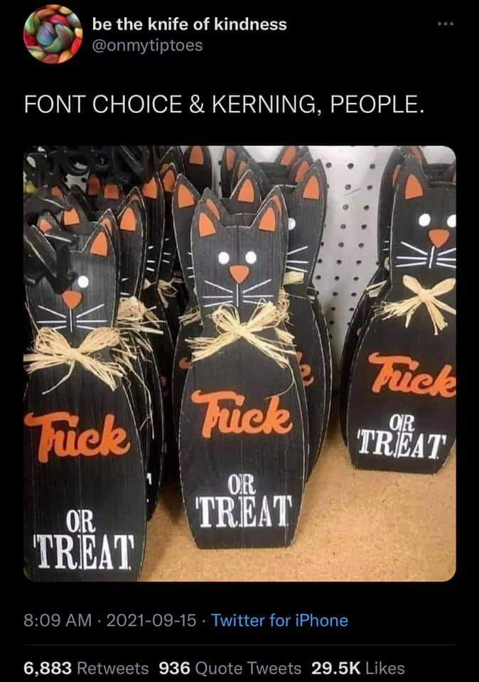
Let me guess? Made in China?
Designed by a Non-English speaking graphic designer using a computer program, approved by a Non-English speaking supervisor, and a run of 100,000 were made last Spring, then shipped over here in the Summer for the Halloween Holiday.
There is a difference between inexpensive and cheap. Too bad many cannot tell the difference.
Maybe made in Chynah, but there are a lot of modern American designers who should have failed graphic design and been drummed out of society.
Like on TV shows, where they do subtitles. White subtitles against a light-colored background, right where the in-show advertisement pops up.
Or kerning, use of sans-serif fonts (great in titles, but crappy in text if small) and the aforementioned lack of contrast all make it hard to see things.
The move to baby colors on a lot of products, light pastels with writing in light pastels is also a major no-no.
Look at the packaging that gets your attention. Bright colors, clear fonts, clear space around the main lettering that allows you to read the damned words. May not be ‘new’ or ‘pretty’ but it gets the job done.
A few things from an engineer who owns a printing business:
1. If you want to practice your kerning, try the Kerning Game. Go to https://type.method.ac/, and give it a try. You’ll get better with practice.
2. The relative readability of fonts has been measured by setting people to the task of reading a passage of text, answering questions about it, and scoring based on both speed and correct answers. One font is more “readable” than another if people can read it and answer the questions correctly in less time. There’s a funny thing about the results, though: when Amercians are measured, serif fonts are more “readable,” while, when Europeans are measured, sans serif fonts are more “readable.” The elementary reading books in the US tend to be set in serif fonts, while the European equivalents tend to be set in sans serif fonts. Or, at least that was the case when the studies I saw (1980s) were done. Like some of the examples in Gladwell’s “Outliers,” sometimes the data aren’t showing what you think they’re showing….
3. Color contrast is a big issue. In the past, I’ve often pointed to “Wired” magazine for bad examples. Type size can be another issue–young designers without a lot of experience tend to set type, particularly on business cards, in sizes too small to be read easily by those of us who are older.
4. I think the example is funny, but my wife probably wouldn’t.
YMMV
(incidentally, there’s a guy who posts here as “pissedoffprinter.” I’d like to talk with him, if he’s willing….)
I spent the first two years of my computer professional career working with newspaper typesetters, so I have a semi-informed interest in that stuff. Ivan’s comments ring a bunch of bells. The bit about color has bugged me over the years, fighting with marketing people who think it’s clever to use gray Helvetica Thin for a company website.
As for legibility, that’s interesting. I’m an immigrant, grew up in Holland in the 1960s. Don’t remember the font used in text books, but I do know that I find serif fonts more legible. (I have a soft spot for Garamond and its close cousin Jenson, used it once for a poetry book I designed and set.)
Years ago when computer graphics programs first became available for the masses, someone created the term “Ransom note typography” for what happens when someone is let loose on a program with lots of fonts available in it, without the understanding or judgment of how to use them. A related but not so blatant problem is what happens when someone uses a “display font” as if it were a “text font”. Say, Kids or Poster Bodoni…
Ivan,
I carry a bright flashlight with me, and do not hesitate to pull it out to read the fine print when necessary. It works.
I am also sort of colorblind as I cannot read the numbers in the circle all the time, but I can pass the yarn tests, so perceiving the contrast of those subtle pastel color choices can be very maddening.
To pkoning–just a couple of quick notes…
I think I encountered the typography/readabliity studies at the MIT AI lab, as an undergraduate. Back in the 70s and 80s, there was a lot of effort in AI to figure out how people worked, so we could make machines emulate that. I don’t think it was much after that, that AI folks realized that the machines could work differently from people, and still achieve the same result.
As for people going wild with typefaces when desktop publishing became a thing, we still call it the ‘ransome note effect.” I used to suggest, to customers who seemed interested in learning, Robin Williams’ book, “The Mac/PC is not a typewriter.”
Finally, if you’re interested in type, there used to be an email forum called “TYPO-L.” It probably still exists in some form, but I unsubscribed about 15 or 20 years ago, because I wasn’t reading it any more. I learned a fair amount about the finer points of type and typography while I was subscribed, though….
To rd–
I, too, have sufficiently below-spec color vision that I don’t see the numbers in the circles, but, on the rare occasions when I have to run an offset press, I have no trouble matching a PMS ink color to a commercially acceptable level. OTOH, when when four-color printing doesn’t match a proof, I’m not very good at seeing which color to add or subtract. Fortunately, we have people in our shop who are much better at that than I am.